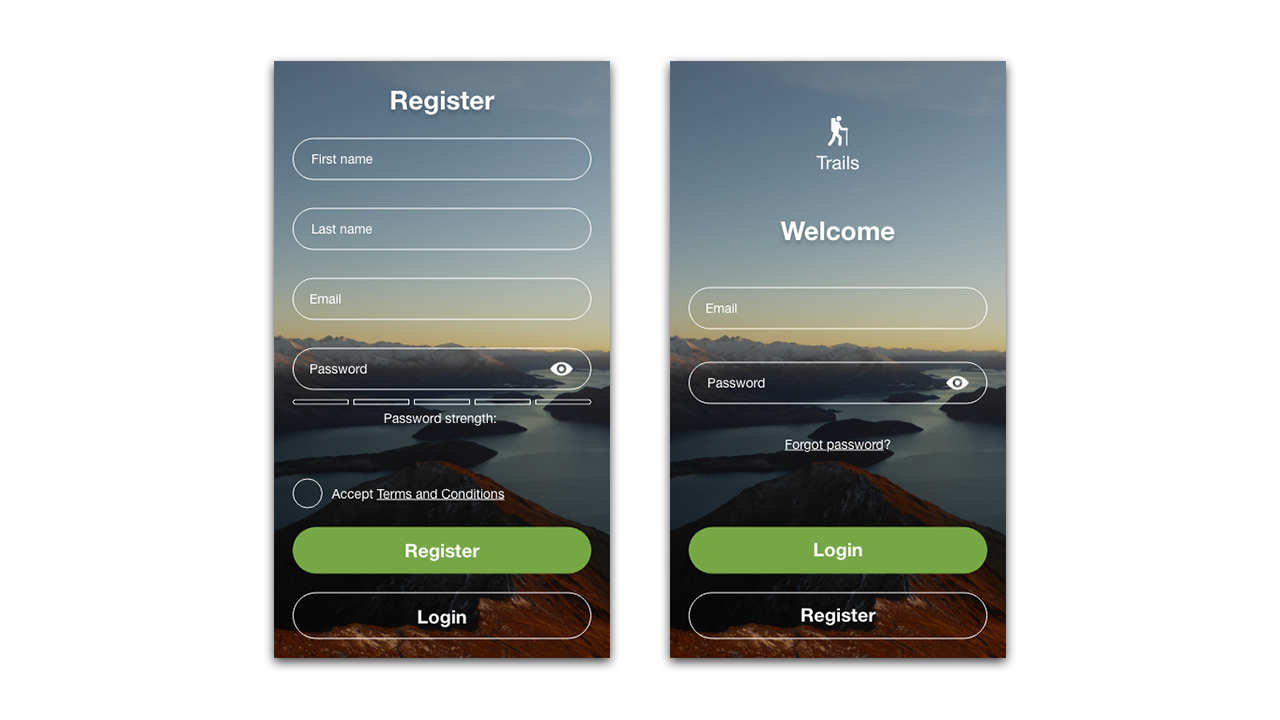
Daily UI Sign Up – Day #001
Daily UI sign up. Day #001 and the #DailyUI challenge is to design a sign up form. What type of design did I create? Let’s take a look.
Design Hint…
“Create a sign up page, modal, form, or app screen related to signing up for something. It could be for a volunteer event, contest registration, a giveaway, or anything you can image.”
Design Solution
Starting out with a few basic sketches, I came up with the following wireframes for my Daily UI sign up form.
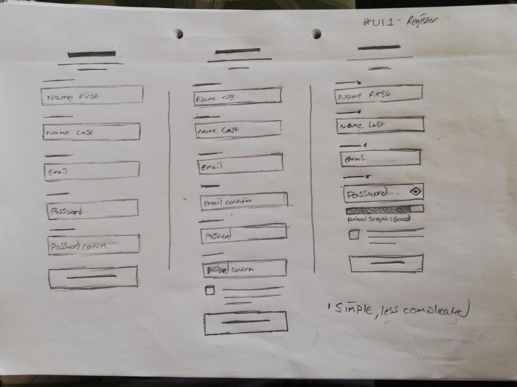
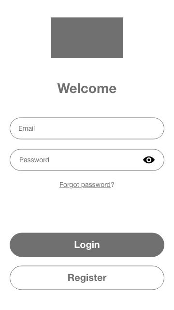
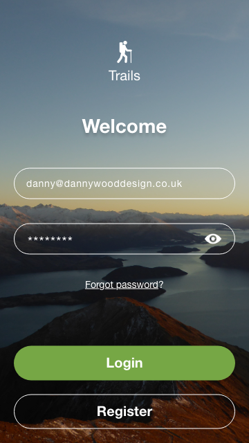
After some brief feedback, I opted for the shorter, more condensed design. I also concluded that I couldn’t just design a sign up form, without it’s counterpart; a log in form.
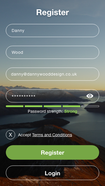
My sign up form was for a hiking based app, with the focus being on a picturesque background image and minimal design elements.
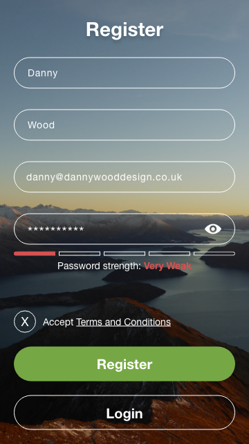
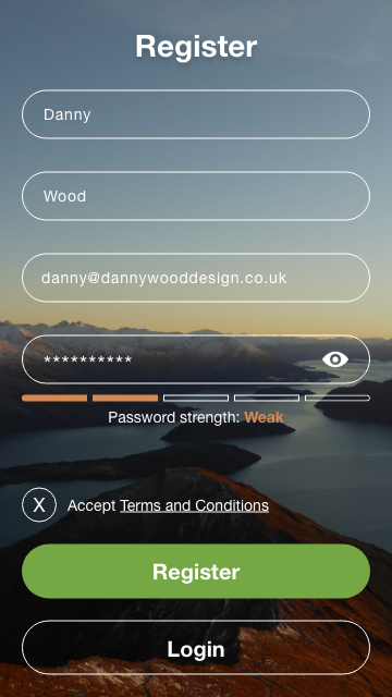
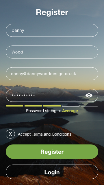
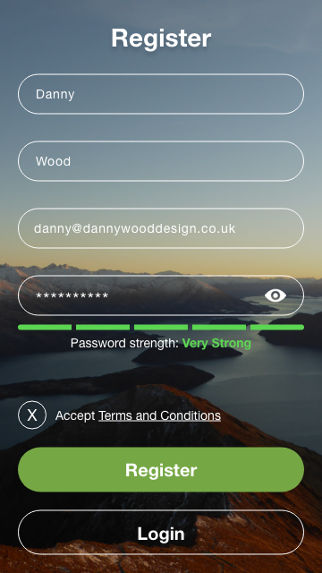
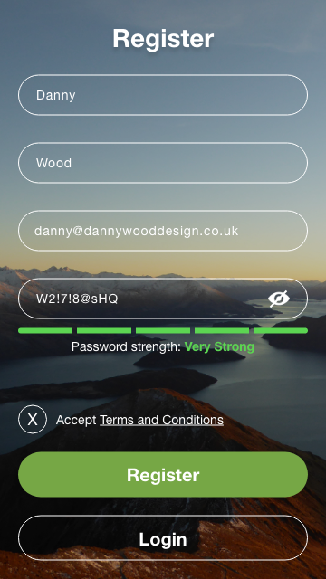
I made sure to include a password strength indicator in the design, as I’m a big advocate for internet security and strong passwords.
You could argue that this is overkill for what would be a hiking based app, but it’s good practice/encouragement/awareness for the end user and the design could quite easily be adapted for another use.
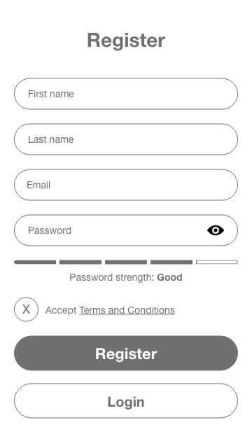
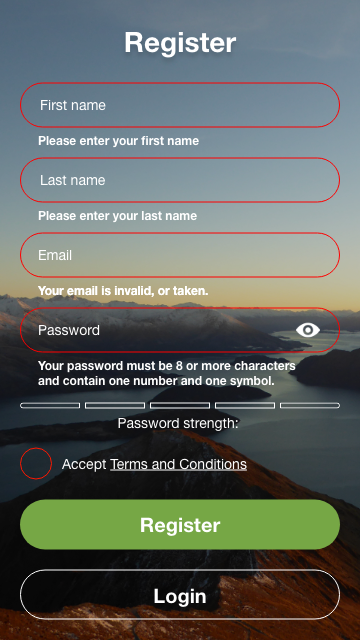
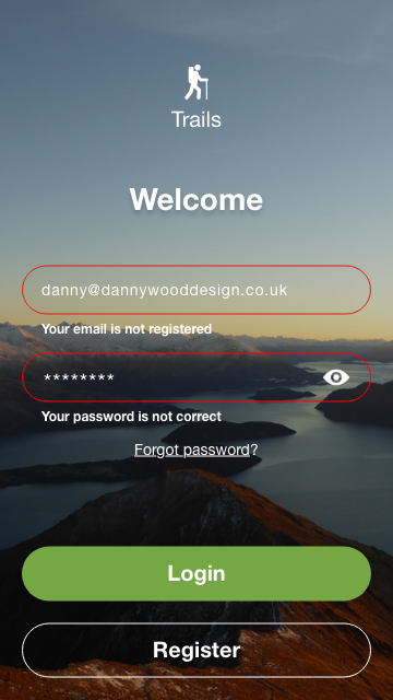
In addition to this, I’m also keen on error reporting and the ‘what ifs’ to do with user behaviour and UX, UI design. So, because of this, I took the time to predict possible outcomes of different interactions within the form; good and bad producing appropriate responses for the end user.
Daily UI Sign Up Form – Register
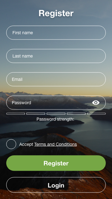
Daily UI Sign Up Form – Login


So, that’s what I designed for my Daily UI sign up form challenge. What do you think? Let me know and keep an eye out for day #002!

