Leydon Lettings Website Redesign
Leydon Lettings asked me to analyse and redesign their company website. Working closely with the company up until this point, as a graphic designer, I had a good insight into the company’s needs.
Delighted to be involved with the project, I started to do some research.
I had wanted to improve certain areas of the site for a while. And I had often come up with inspirational design concepts.
I had also wanted to help the company get the best website, in order to reflect their company goals. Which I felt needed more recognition than they were getting.
One of the biggest challenges with the website, was the sheer scale of it. Leydon Lettings not only provided various different types of accommodation – primarily student – but they also provided several property and company features that other companies didn’t.
Research showed several areas that needed attention. In particular, the following:
- Site structure
- Usability
- Search engine optimisation (SEO)
- Design
- Web responsive
- Pulling property data from the property management program, CFP.
- Conversation rate
- Bounce rate
- Showing unique company features
The following UX and UI designs do not match exactly, as the UI designs were a prototype of an earlier UX design.
Design Proposal/Process
- Identifying the problem
- Research
- Solution
- Purpose
- Planning
- Target Audience
- Needs
- Method
- Sitemap
- Wireframes
- User testing
- Prototype
- User testings
- Wireframes
- User testings
- Active design elements
- Userflow Diagram (mobile)
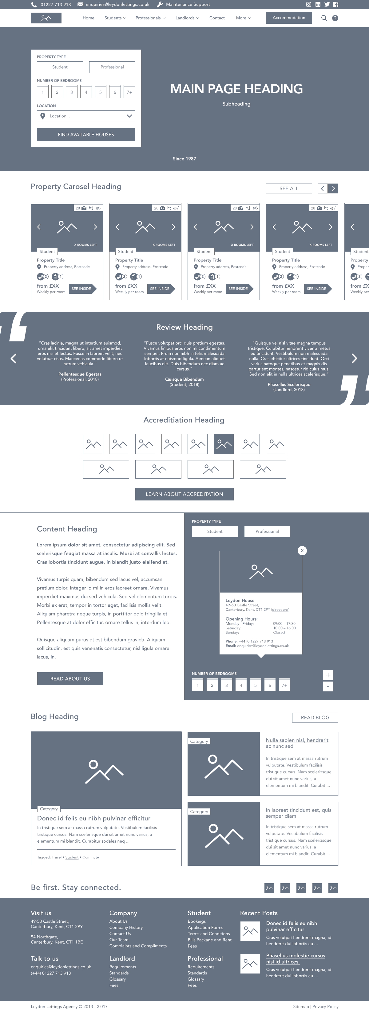
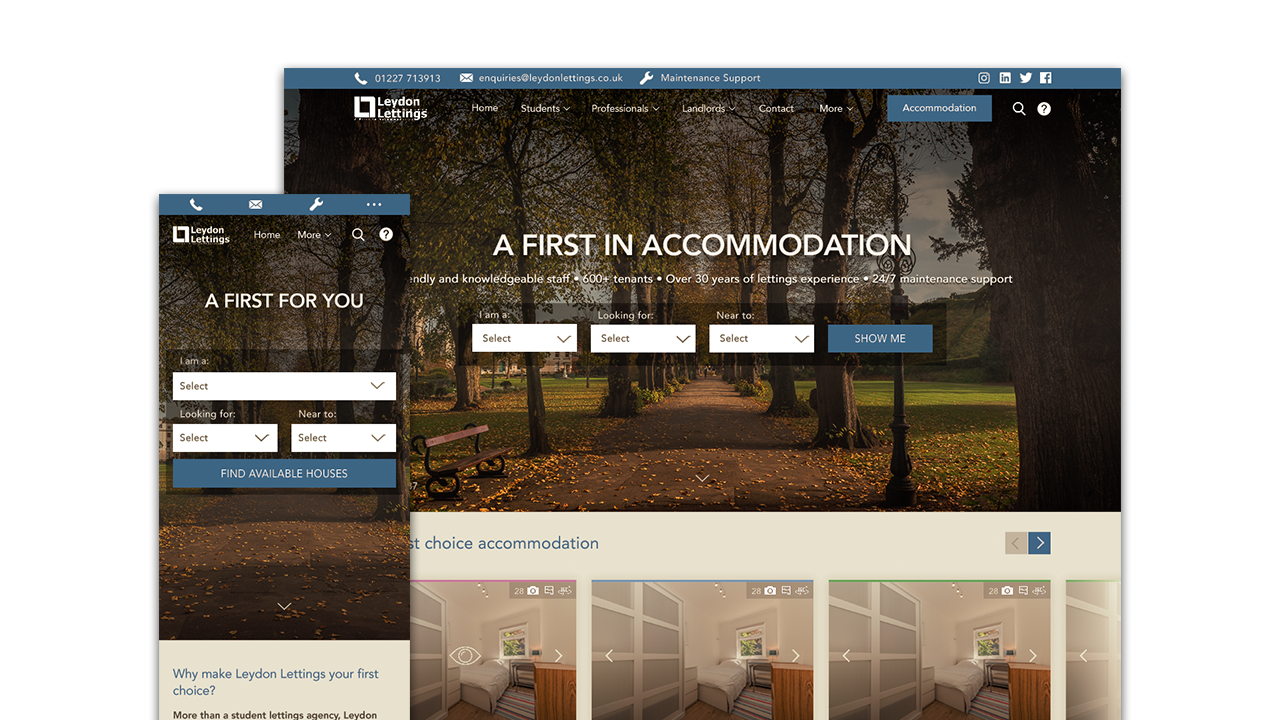
Index Page
UX Mobile
Scroll over image for full design

UI MOBILE
Scroll over image for full design

UX DESKTOP
Scroll over image for full design

DESKTOP UI
Scroll over image for full design

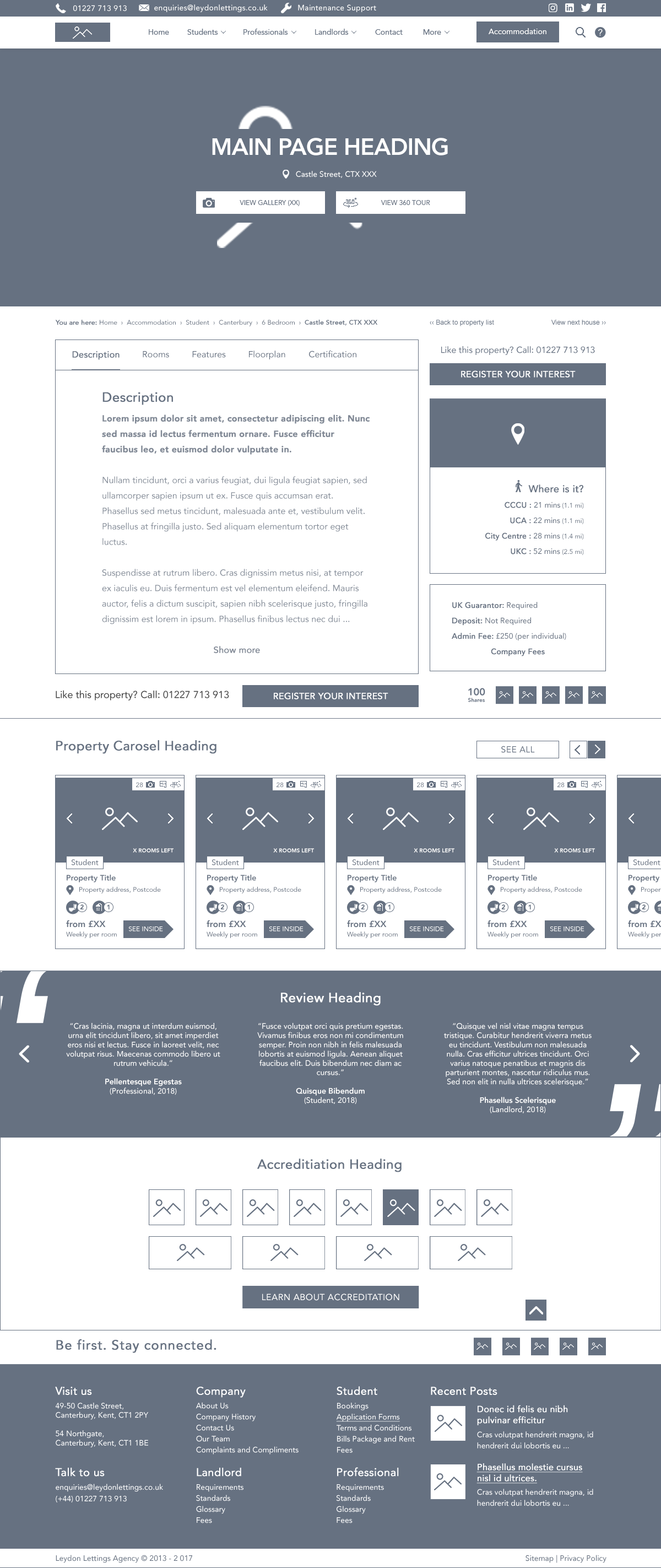
Property Page
UX Mobile
Scroll over image for full design

UI Mobile
Scroll over image for full design

UX Desktop
Scroll over image for full design

UI Desktop
Scroll over image for full design

The project unfortunately didn’t make it into development. This was partly due to the size of the site. As well as the cost of integrating CFP (the property management program) with the website.
This resulted in the company opting for a packaged website, from a specialist company, who had their own CMS, which linked to CFP.
To say I wasn’t devastated, after all the work I’d put in, would have been an understatement. But these things happen and was in the companies best interests overall.
However, if you like what you see, head on over to my contact page and let me know!


